Input
Inputs allow users to enter text into a UI. They typically appear in forms and dialogs.
Usage
import Icon from 'react-native-vector-icons/FontAwesome';
import { Input } from 'react-native-elements';
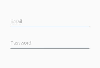
<Input
placeholder='BASIC INPUT'
/>
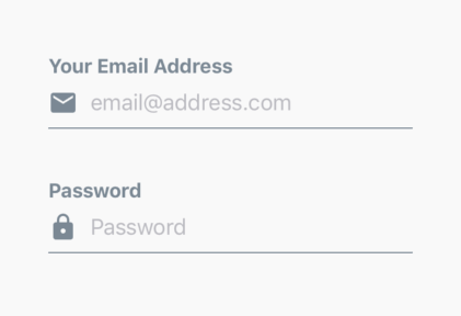
<Input
placeholder='INPUT WITH ICON'
leftIcon={{ type: 'font-awesome', name: 'chevron-left' }}
/>
<Input
placeholder='INPUT WITH CUSTOM ICON'
leftIcon={
<Icon
name='user'
size={24}
color='black'
/>
}
/>
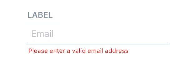
<Input
placeholder='INPUT WITH ERROR MESSAGE'
errorStyle={{ color: 'red' }}
errorMessage='ENTER A VALID ERROR HERE'
/>
Props
This component inherits all native TextInput props that come with a standard React Native TextInput element, along with the following:
containerStyledisableddisabledInputStyleinputContainerStyleerrorMessageerrorStyleerrorPropsinputComponentinputStylelabellabelStylelabelPropsleftIconleftIconContainerStylerightIconrightIconContainerStyle
Reference
containerStyle
styling for view containing the label, the input and the error message
| Type | Default |
|---|---|
| View style (object) | none |
disabled
disables the input component
| Type | Default |
|---|---|
| boolean | false |
disabledInputStyle
disabled styles that will be passed to the style props of the React Native TextInput (optional)
| Type | Default |
|---|---|
| Text style (object) | none |
inputContainerStyle
styling for Input Component Container (optional)
| Type | Default |
|---|---|
| View style (object) | none |
errorMessage
adds error message (optional)
| Type | Default |
|---|---|
| string | none |
errorStyle
add styling to error message (optional)
| Type | Default |
|---|---|
| object | none |
errorProps
props to be passed to the React Native Text component used to display the
error message (optional)
| Type | Default |
|---|---|
| {...Text props} | none |
inputComponent
component that will be rendered in place of the React Native TextInput
(optional)
| Type | Default |
|---|---|
| React Native Component | TextInput |
inputStyle
style that will be passed to the style props of the React Native TextInput
(optional)
| Type | Default |
|---|---|
| object | none |
label
add a label on top of the input (optional)
| Type | Default |
|---|---|
| string OR React element or component | none |
labelStyle
styling for the label (optional); You can only use this if label is a string
| Type | Default |
|---|---|
| object | none |
labelProps
props to be passed to the React Native Text component used to display the
label or React Component used instead of simple string in label prop
(optional)
| Type | Default |
|---|---|
| {...Text props} OR passed component props | none |
leftIcon
displays an icon on the left (optional)
| Type | Default |
|---|---|
| {...Icon props} OR component | none |
leftIconContainerStyle
styling for left Icon Component container
| Type | Default |
|---|---|
| View style (object) | none |
rightIcon
displays an icon on the right (optional)
| Type | Default |
|---|---|
| {...Icon props} OR component | none |
rightIconContainerStyle
styling for right Icon Component container
| Type | Default |
|---|---|
| View style (object) | none |
Styles explanation
| Input with a label and an error message | Styles explanation |
|---|---|
 | 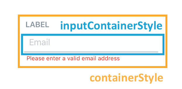 |
Interaction methods
| method | description |
|---|---|
| focus | Focuses the Input |
| blur | Removes focus from the Input |
| clear | Clears the text in the Input |
| isFocused | Returns true or false if the Input is focused |
| setNativeProps | Sets props directly on the react native component |
| shake | Shakes the input for error feedback |
Calling methods on Input
Store a reference to the Input in your component by using the ref prop provided by React (see docs):
const input = React.createRef();

<Input
  ref={input}
  ...
/>
You can then use the Input methods like this:
input.current.focus();
input.current.blur();
input.current.clear();
input.current.isFocused();
input.current.setNativeProps({ value: 'hello' });
input.current.shake();