Linear Progress
Progress indicators inform users about the status of ongoing processes, such as loading an app, submitting a form, or saving updates. They communicate an app’s state and indicate available actions, such as whether users can navigate away from the current screen.
Usage
import { LinearProgress } from 'react-native-elements';
<LinearProgress color="primary" />
Props
Also receives all View props
Reference
value
The value of the progress indicator for the determinate variant. Value between 0 and 1.
| Type | Default |
|---|---|
| number | 0 |
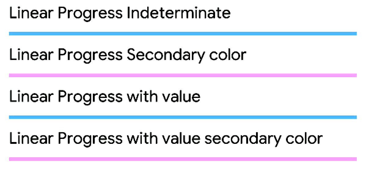
variant
Type of button (optional)
| Type | Default |
|---|---|
determinate, indeterminate | indeterminate |
style
add additional styling for linear progress component (optional)
| Type | Default |
|---|---|
| View style (object) | none |
color
color for linear progress
| Type | Default |
|---|---|
primary,secondary OR color name | secondary |
trackColor
Track color for linear progress
| Type | Default |
|---|---|
| string | color with transparency |