Overlay
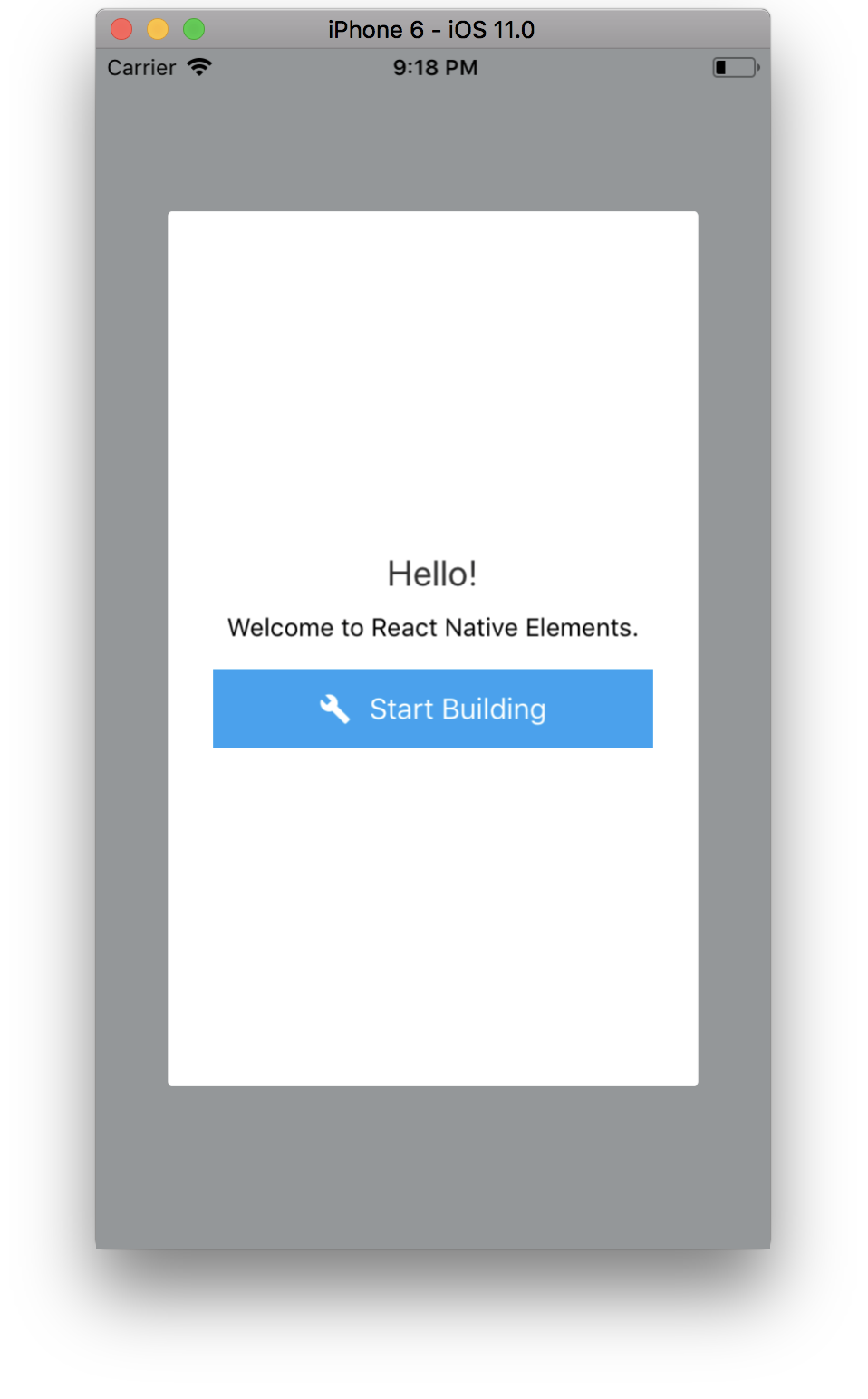
The Overlay is a view that floats above an app’s content. Overlays are an easy way to inform or request information from the user.

Usage
import React, { useState } from 'react';
import { Button, Overlay } from 'react-native-elements';

const OverlayExample = () => {
  const [visible, setVisible] = useState(false);

  const toggleOverlay = () => {
    setVisible(!visible);
  };

  return (
    <View>
      <Button title="Open Overlay" onPress={toggleOverlay} />

      <Overlay isVisible={visible} onBackdropPress={toggleOverlay}>
        <Text>Hello from Overlay!</Text>
      </Overlay>
    </View>
  );
};
Web-platform specific note:
You must pass a valid React Native
Modalcomponent implementation intoModalComponentprop becauseModalcomponent is not implemented yet inreact-native-web
...
import Modal from 'modal-react-native-web';

...

<Overlay ModalComponent={Modal} ... />
...
Props
Also receives all Modal props
Reference
children
What the modal will render
| Type | Default |
|---|---|
| React Element | none |
backdropStyle
Style of the backdrop container
| Type | Default |
|---|---|
| View Style (object) | Internal Style |
fullScreen
If set to true, the modal will take up the entire screen width and height
| Type | Default |
|---|---|
| boolean | false |
isVisible
If true, the overlay is visible
| Type | Default |
|---|---|
| boolean | false |
ModalComponent
override React Native Modal component (usable for web-platform)
| Type | Default |
|---|---|
| React Native Component | Modal |
overlayStyle
style of the actual overlay
| Type | Default |
|---|---|
| View Style (object) | Internal Style |
onBackdropPress
handler for backdrop press (only works when fullscreen is false)
| Type | Default |
|---|---|
| function | none |