Tabs
Tabs organize content across different screens, data sets, and other interactions.
Usage
import { Tab } from 'react-native-elements';
<Tab value={index} onChange={setIndex}>
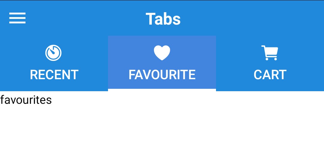
<Tab.Item title="recent" />
<Tab.Item title="favorite" />
<Tab.Item title="cart" />
</Tab>
<TabView value={index} onChange={setIndex} >
<TabView.Item style={{ backgroundColor: 'red', width: '100%' }}>
<Text h1>Recent</Text>
</TabView.Item>
<TabView.Item style={{ backgroundColor: 'blue', width: '100%' }}>
<Text h1>Favorite</Text>
</TabView.Item>
<TabView.Item style={{ backgroundColor: 'green', width: '100%' }}>
<Text h1>Cart</Text>
</TabView.Item>
</TabView>
Props
Also receives all View props
Child Component
Tab.Item
Props
Receives all Button props
TabView
Props
TabViewItem
Props
Receives all View props
Reference
value
Child position index value.
| Type | Default |
|---|---|
number | 0 |
onChange
On Index Change Callback
| Type | Default |
|---|---|
function | none |
disableIndicator
Disable the indicator below
| Type | Default |
|---|---|
boolean | false |
indicatorStyle
Additional styling for tab indicator (optional)
| Type | Default |
|---|---|
| View style (object) | Internal Style |
variant
Background Variant
| Type | Default |
|---|---|
| 'primary' or 'default' | default |
animationtype
| Type | Default |
|---|---|
| 'spring' or 'timing' | spring |
animationconfig
| Type | Default |
|---|---|
| 'Object' | none |